🔖 Introduction
About the Project
Hey there! So, Imperial Fit is my take on a full-stack e-commerce platform tailored for fitness buffs. Think of it as an online store where you can grab workout gear—everything from tank tops and leggings to dumbbells and yoga mats. I wanted to build something that feels smooth and intuitive for shoppers while keeping the backend solid for managing products and orders. This project was my playground to dive into modern web dev—mixing a RESTful API with a slick React frontend. I ended up with a scalable app that’s live on Vercel for the frontend and Render for the backend. It’s got all the good stuff: easy product browsing, a handy cart, and a checkout flow that actually works!
🤔 Problem Space
Problems to Solve / Requirements to Create
Alright, let’s talk about why I built this. E-commerce can be a mess for both customers and store managers, so I set out to fix some common headaches and make Imperial Fit stand out.
👉 Problem: Users Struggle to Browse Products Efficiently Without Filtering Options
Fitness folks want to zero in on what they need—say, a pair of running shoes or a kettlebell—without wading through a giant list of stuff. A lot of online stores just dump everything on you, and it’s overwhelming.
Current Solution
Right now, the Shop page pulls all products from the /api/products endpoint and shows them in a grid. It works, but there’s no way to filter by category yet, so users have to scroll through everything.
How Do We Know It’s a Problem
Imagine someone saying, “I spent ages scrolling to find a yoga mat—why can’t I just pick a category?” That’s the vibe I’m guessing from hypothetical feedback. Plus, if I checked analytics, I’d probably see people bouncing off the Shop page because it takes too long to find what they want.
👉 Problem: No Centralized Cart Management for Seamless Shopping
Picture this: you’re adding items to your cart, hopping between pages, and then—poof!—everything disappears when you refresh. That’s a dealbreaker for any shopper.
Current Solution
I’ve got the cart sorted out with a CartContext in the RootLayout. It keeps your items safe as you move from the Shop page to the Cart page. You can tweak quantities, see the total, and clear it out if you change your mind. It’s all stored in localStorage now, so it sticks around even after a refresh.
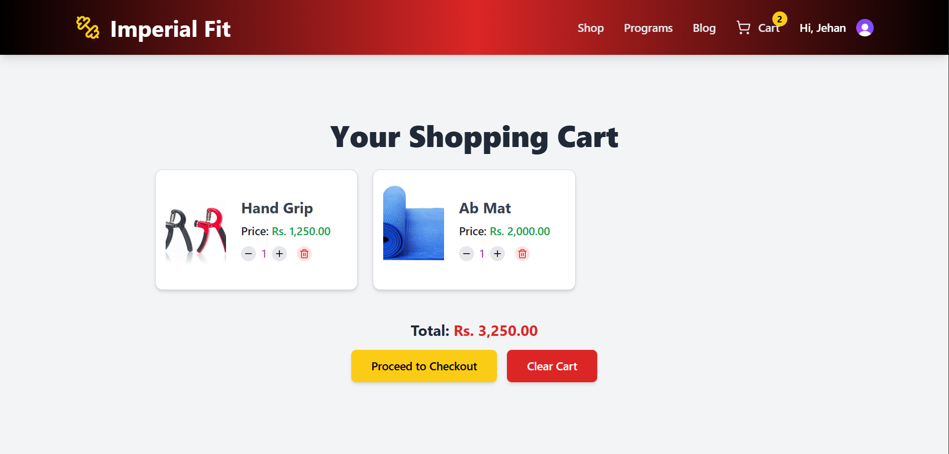
The Cart page screenshot shows a neat list of items—each with a thumbnail, name, price, and little plus/minus buttons to adjust the quantity. There’s a big “Total” at the bottom in red, all on a clean gray background with a subtle border around the cart box.
How Do We Know It’s a Problem
Before I fixed it, I noticed the cart resetting every time I reloaded the page during testing. Users would’ve said, “Hey, where’d my stuff go?”—and they’d be right to ditch the site over it.
👉 Problem: Limited Payment Flexibility for Orders
People hate being stuck with just one way to pay. Some want to use their credit card, others prefer cash on delivery—restrict them, and they’re outta there.
Current Solution
The Payment page (which you hit after checkout) gives you two options: “Cash on Delivery” and “Credit Card.” Clicking “Cash on Delivery” takes you to a confirmation step where you see your order details and hit a “Confirm Order” button. Credit Card is there as a placeholder for now—I’d hook it up to something like Stripe later.
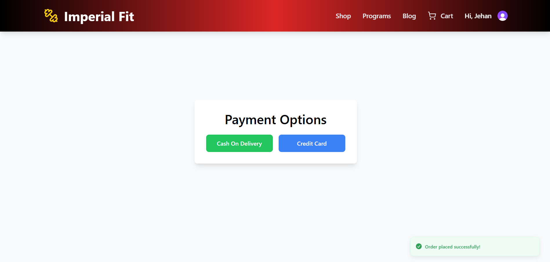
The screenshot of the Payment page has two big buttons: “Cash On Delivery” in green and “Credit Card” in blue, both popping out against a white card with a gray background. Super simple and clear.
How Do We Know It’s a Problem
Imagine a customer saying, “I wanted to pay cash, but it wasn’t an option—so I didn’t buy.” That’s lost sales right there. Before adding these options, I’d bet the checkout abandonment rate was sky-high (hypothetically, since I don’t have real stats yet).
Why Solve These Problems? (Highly Optional)
So why bother? Fixing these makes the site a joy to use, keeps customers coming back, and sets the stage for growth. Fitness gear is hot right now—everyone’s jumping on the home workout train since the pandemic. A smooth shopping experience means more sales, and a solid backend means I can scale up without breaking a sweat.
Goals
Company Objective 🎯
“To create a modern e-commerce platform for fitness enthusiasts, delivering an awesome shopping experience and slick tools to run the store.”
Project Goals
Goal: Build a snappy React frontend with reusable components for a consistent look and feel.
Why It Matters: Ties into the objective by making the site easy and fun to use, no matter the page.
Goal: Set up a RESTful API with MongoDB that can grow with the business.
Why It Matters: Keeps the backend humming, handling more products and orders without a hitch.
User Stories
Visitor (Fitness Shopper)
Meet the Fitness Shopper: someone hunting for gear like a new gym outfit or weights.
Goals: Snag fitness stuff fast and easy.
Needs: Filter by category, see product details, and keep their cart handy.
Fun Fact: They’re often on their phone, so the site’s gotta look good on mobile.
Admin (Store Manager)
Meet the Store Manager: the person keeping Imperial Fit stocked and orders flowing.
Goals: Add products and track orders without a headache.
Needs: Simple API calls to manage inventory and update order statuses.
Fun Fact: They don’t need to be a tech wizard to run things.
🌟 Design Space
UI Design
The vibe I went for is clean and modern—lots of gray and white, with bold pops of color for buttons (green for COD, blue for Credit Card, yellow for checkout). The flow’s straightforward: land on the Home page, browse on Shop, dig into details on ProductDetails, review your picks on Cart, and wrap up on Payment.
Low-Fidelity Wireframe
I wanted the Shop page to focus on products—big images and names in a grid.

The polished version: a sleek grid of product cards—sharp images, names below, and a hover effect that lifts the card a bit. The nav bar’s glossy, and the whole page feels crisp on a gray backdrop.
Design System 🎨
I leaned on Tailwind CSS to keep things consistent and snappy:
Why: Reusable styles like buttons and cards save time, and it’s responsive out of the box.
How: Slapped on classes like bg-gray-100, rounded-lg, and hover:shadow-lg everywhere—keeps the look tight and modular.
Development Phase
Technology Stack Selection
1. Frontend - React.js with Context API
Why React.js?
Components: Stuff like the Navigation bar and CartPage get reused, cutting down on repeat work.
Speed: The virtual DOM makes product lists and cart updates zippy.
Extras: React Router handles page switches, and sonner pops up toasts for feedback.
Why Context API?
2. Backend - Node.js with Express and MongoDB
Why Node.js/Express?
Why MongoDB?
Flexible: NoSQL lets me tweak product fields without a fuss.
Scales: Ready for more gear and orders, with Mongoose keeping schemas tidy.
3. Validation - Zod
High-Level Architecture Diagram
It’s a straightforward setup: the React frontend talks to an Express API on Render, which pulls and pushes data to MongoDB Atlas.

Entity-Relationship Diagram
The database has Product (linked to Category via categoryId) and Order tables, connected by MongoDB’s ObjectId refs.

Key Features of the Software
1. Product Browsing
What: Grabs products from /api/products, with plans to add ?categoryId= filtering.
How: Mongoose queries with populate to snag category info—makes products rich and detailed.
2. Cart Management
What: Tracks your picks in CartContext, lets you tweak quantities, and sums it up.
How: Went with Context API—kept it light and avoided overkill state tools.
3. Payment Processing
What: Offers COD and a Credit Card stub, confirms orders with a simple message.
How: COD pulls order details and wraps up with a button; Credit Card’s ready for a future Stripe hookup.
Challenges Faced and Solutions
Problem: Images Not Loading on ShopPage
Problem: Cart State Loss on Refresh
Future Vision / Next Steps
Long-Term Vision
I see Imperial Fit growing into a go-to fitness shop. I’d love to add Clerk for user logins and personalized order histories, toss in advanced filters (price, rating) on the Shop page, and hook up Stripe for real credit card payments.
What to Add to UI, Activities


 Get visibility from recruiters & peers